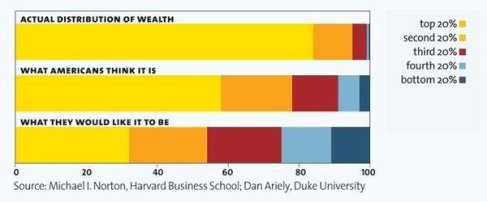
"In last night's introduction to Rachel's interview with Chris Hayes about his new book, she showed a graph depicting the wealth distribution people prefer, the distribution they think exists and the actual distribution of wealth in America. Folks on the Twitter clamored for the link, and our intern Sally tells me there are a lot of requests for it in the Rachel@msnbc.com mailbox as well, so here it is."
http://maddowblog.msnbc.msn.com/_news/2012/06/21/12345961-that-wealth-inequality-chart-rachel-showed-last-night?lite

No comments:
Post a Comment